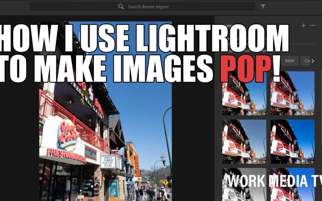
Every photographer has their own editing style, and over time, you just kind of figure out what works for you. I’ve developed a workflow in Adobe Lightroom that helps me turn good photos into eye-catching, dramatic images that stand out on social media, websites, or even print. In this post, I’m going to walk you through how I typically process an image—from RAW to final export—and show you a few tricks I like to use along the way.
Start with the Right File
When I pull photos from my Canon EOS R, I usually work with the RAW files (CR3 format). They give me more flexibility when editing. The JPEG version already has in-camera processing applied, and sometimes it looks great right out of the gate—but if I want full control, I go with the RAW file.
Let Lightroom Guide You (Then Make It Yours)
One of the great features in Lightroom is the “Recommended Presets” feature. Lightroom will analyze the image and suggest different filter styles you can preview just by hovering over them. Sometimes I use one of those as a starting point. Other times I go straight into manual adjustments—contrast, highlights, shadows, vibrance, and so on.
I tend to like deep saturation, rich contrast, and a bit of vignette around the edges to pull your eye toward the center of the frame. It gives the image a little more drama without being over-processed (unless you’re going for that kind of look, which is fun too).
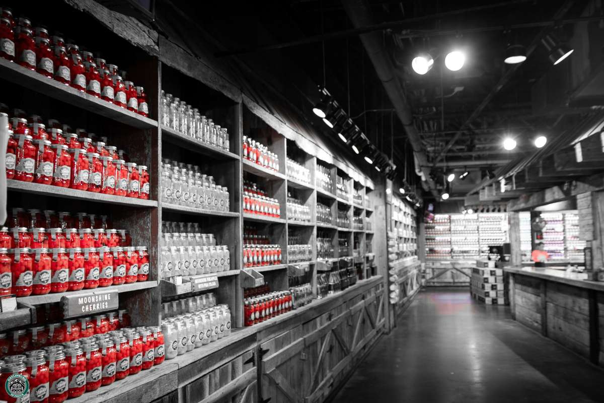
My Favorite Trick: The Red-Only Pop
One of the more unique effects I use occasionally is pulling all the color out of a photo except for red. It creates a high-impact, stylized black-and-white image with a burst of bold color. To do this in Lightroom, I go into the Color Mixer and desaturate all the color channels except for red. Then I bump up the saturation and luminance on the red channel just a bit.
It’s not something I’d use all the time—but when the photo is right for it, it really grabs attention.
Dehaze, Clarity, and Print Brightness
I also like to use Lightroom’s Dehaze and Clarity sliders to give an image more focus and bite—especially if it looks a little flat or hazy. And if I’m prepping an image for print, I’ll even dim my monitor slightly to get a better sense of how it will look off-screen.
For exporting to the web, I usually resize the long edge to about 2000 to 2400 pixels and set the quality to around 70–80%. It keeps file sizes manageable without sacrificing too much detail.
Final Thoughts
There are a thousand ways to process a photo, and no one way is the “right” way. This is just what works for me—and I’m always experimenting. If you’re just getting into Lightroom or looking to fine-tune your own workflow, I hope this gives you a few ideas to try out.
And if you ever need help with editing, photography, or producing strong visual content for your business or brand, that’s exactly what I do.
You can reach me at info@workmedia.net or check out more at workmedia.net.
Thanks for reading—and keep creating.